It is one of the most important and effective way of classification. To simply put the working mechanism of the algorithm is that it tries fixing a line (in case of 2 dimensional data), plane (in 3 dimensional data) or a hyperplane (in case of any more than 3 dimensional data).
For simplicity, let’s first see the construct in case of a 2 dimensional data. I will first be constructing an arbitrary data set.
# Some important imports

import pandas as pd, numpy as np, matplotlib.pyplot as plt, seaborn as sns

from sklearn.svm import SVC
import plotly.express as px
def making_df(slope_type=1,n=100, p1=100, p2=30, p3=2):
    np.random.seed(n)

    p=np.random.randn(p1)*p2
    q=np.random.randn(p1)*p2

    if slope_type == 1:
        r=p+p3*p.max()
        s=q-p3*q.max()
    else:
        r=p+p3*p.max()
        s=q+p3*q.max()


    df1 = pd.DataFrame({'ones':np.ones(len(p)),'feature1':p,
                       'feature2':q, 'label':np.ones(len(p))})

    df2 = pd.DataFrame({'ones':np.ones(len(r)),'feature1':r,
                       'feature2':s, 'label':[-1]*len(r)})

    df = pd.concat([df1,df2], axis=0)
    df = df.sample(n=len(df))
    return [df,p,q,r,s]
Without focusing much on the code, let’s just take it for granted that the above function returns a dataframe with two visually distinct clusters of data points which we can classify as two classes. It also returns the coordinates of the two classes: (p,q) for negative data points and (r,s) for positive data points. It takes the type of slope (whether positive or negative) and a number of parameters as input for creating the required dataframe The above function has been constructed since we may require to create dataframes multiple times for practicals.
The general equation of a straight line can be written as:
ax + by + c = 0
where x and y are variables.
slope = -(a/b) ; intercept = -(c/b)
Without much pondering let’s first create an arbitrary dataframe and plot it to get a visual representation and take a look toward what we are dealing with at the first place.
obt = making_df(slope_type=1,n=40)

df = obt[0]
p = obt[1]
q = obt[2]
r = obt[3]
s = obt[4]


plt.figure(figsize=(20,8))
plt.scatter(p, q, facecolors='purple', marker='_', s=100)
plt.scatter(r,s, facecolors='red',marker='+', s=100)
plt.xlabel('Features', fontsize=16)
plt.ylabel('Label', fontsize=16)


plt.show()

Now we clearly have a data set with distinguished data points, conveniently labeling ‘+1’ and ‘-1’.
def primary_fit(weight):

    def nor(lst):
        factor = (1/sum([i**2 for i in lst[:2]]))**0.5
        return [i*factor for i in lst[:2]]

    a = nor(weight)[0]
    b = nor(weight)[1]
    c = weight[2]


    def st(a,b,c):
        slope = -(a/b)
        intercept = -(c/b)

        x = np.concatenate([p,r])
        y = slope*x + intercept

        plt.plot(x,y)

        return [slope,intercept]


    plt.figure(figsize=(20,8))
    plt.scatter(p, q, facecolors='purple', marker='_', s=100)
    plt.scatter(r,s, facecolors='red',marker='+', s=100)
    plt.xlabel('Features', fontsize=16)
    plt.ylabel('Label', fontsize=16)

    st(a,b,c)
    plt.show()
We can attempt to fit a line with a = -1, b = 1, c = 110
primary_fit([-1,1,110])

With the selected values of a, b, and c, we successfully fit a line, ax+by+c=0, within the data points that segregates the points in two distinct clusters. This line is also known as a hyperplane. Dimensions of this hyperplane increases with increase in dimensions of data. Analogically, it could be a 2D plane if we have 3D data, might be a cube in 4D data set or even a tesseract in a 5D data set and so on.
Looking at the graph it would be fair to say for any values of x and y, if ax + by + c > 0, it can be classified as ‘-1’ and for ax + by + c < 0, it can be classified as ‘+1’.
If we try using different values of a, b, and c, we may get different lines accordingly. Let’s try fitting another line with a = -1, b = 3, c = 80
primary_fit([-1,3,80])

We get entirely different lines with each chosen values of a, b, and c.
There are mainly two problems that persists. First one is that values of a, b, and c must be optimized to get the best fit line. Second one is that during implementation of the model, there may be data points appearing out of the blue which may be too close to the classifier or may lie on the opposite side of the classifier resulting in wrong classification.
In order to cope with these issues, concepts of margins are introduced. Let’s take a dive and try to understand the underlying concepts.
Simply put, margins can be referred as the extensions of the classifier. It is sum of the distances from the classifier to the nearest data point of both of the classes.

SVM Formulation
li X (W . yi) ≥ M
The term (W . yi) is the distance which is a vector and therefore has the same sign as that of the class. Thus when the class is multiplied with the distance, the result will always be positive.
From the above derivation we can easily calculate the distance ‘d’ of a point P from a line. Now, let’s try fitting a classifier with the maximum margin, i.e., it would be at the farthest most distance from the classifier’s closest data points of the both classes.
def sup(weight, epsilon=0):
    def nor(lst):
        factor = (1/sum([i**2 for i in lst[:2]]))**0.5
        return [i*factor for i in lst[:2]]

    a = nor(weight)[0]
    b = nor(weight)[1]
    c = weight[2]

    def st(a,b,c):
        slope = -(a/b)
        intercept = -(c/b)

        x = np.concatenate([p,r])
        y = slope*x + intercept

        return [x,y]


    df['distances'] = np.matmul(np.array(df.iloc[:,:3]),np.array([c,a,b]))

    df['formulation'] = df.label * df.distances

    if -(a/b)>0:
        df_neg = df[df.label<0].sort_values('formulation')
        df_pos = df[df.label>0].sort_values('formulation')
    elif -(a/b)<0:
        df_neg = df[df.label<0].sort_values('formulation', ascending=False)
        df_pos = df[df.label>0].sort_values('formulation', ascending=False)


    neg_dist = df_neg.formulation.values[0]
    pos_dist = df_pos.formulation.values[0]


    def vert_dist(distance):
        import math
        slope = -(a/b)
        angle = abs(math.degrees(math.atan(slope)))
        vertical = distance/math.cos(math.radians(angle))
        return vertical

    neg_vert_dist = vert_dist(neg_dist)
    pos_vert_dist = vert_dist(pos_dist)


    intercept = -(c/b)
    pos_intercept = intercept + pos_vert_dist
    neg_intercept = intercept - neg_vert_dist
    c_intercept = min([neg_intercept, pos_intercept]) + abs((neg_intercept - pos_intercept)/2)

    c_pos = -(pos_intercept*b)
    c_neg = -(neg_intercept*b)
    c_new = -(c_intercept*b)


    if epsilon != 0:

        margin = (neg_dist+pos_dist)*(1-epsilon)
        distance = margin/2
        dist_vert_dist = vert_dist(distance)

        pos_intercept = c_intercept + dist_vert_dist
        neg_intercept = c_intercept - dist_vert_dist
        c_pos = -(pos_intercept*b)
        c_neg = -(neg_intercept*b)


    plt.figure(figsize=(20,8))
    plt.scatter(p, q, facecolors='purple', marker='_', s=100)
    plt.scatter(r,s, facecolors='red', marker='+', s=100)
    plt.xlabel('Features', fontsize=16)
    plt.ylabel('Label', fontsize=16)

    plt.plot(st(a,b,c_new)[0], st(a,b,c_new)[1], linewidth=3.5, label='classifier')
    plt.plot(st(a,b,c_pos)[0], st(a,b,c_pos)[1], '--', linewidth=1, alpha=0.8, label='negative margin')
    plt.plot(st(a,b,c_neg)[0], st(a,b,c_neg)[1], '--', linewidth=1, alpha=0.8, label='positive margin')
    plt.legend()
    plt.show()
Note :- The above function is just for visualization and demonstration purpose only for getting a better understand only. It does not represent the actual model building in any way.
weights = [-1,1,110]
sup(weights)

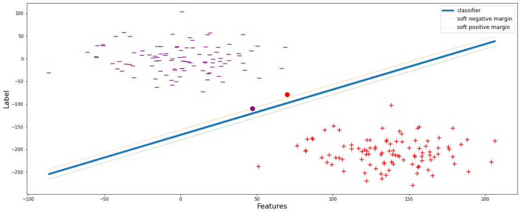
The negative and positive margin lines pass through the classifier’s closest negative and positive data points respectively. But there could be cases when the data points are in the close proximity of the classifier. During those scenarios, the model tries to overfit by shrinking the margin since the model always tends to attain the ideal condition of producing 0 errors. Let’s visualize this.
sup(weights, overfit=True)

This will obviously perform well during training but the major drawback is that since the margin is small, i.e. the decision boundary is shrinked, the model will definitely wrongly classify many of the classes during evaluation or testing. Let’s see it visually. During implementation of the overfitted model, let’s assume to get a data point belonging to positive classifier, yet appears above the negative margin. Therefore the model will wrongly classify it to be ‘-1’, eventually decreasing the accuracy.
sup(weights, overfit=True, test_pos_pos=30)
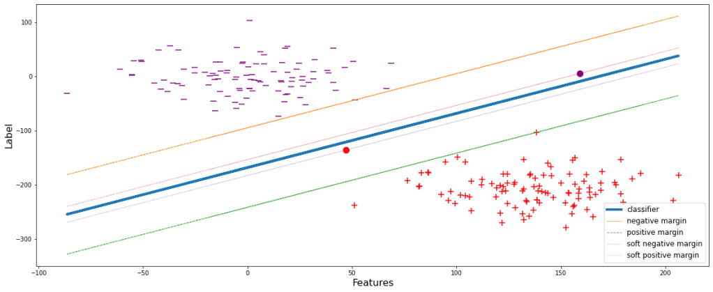
To deal with this problem, a slack variable (ϵ) is introduced which is incorporated with the SVM formulation. Let’s look at the effects and advantages:
li X (W . yi) ≥ M(1-ϵi)
We can infer from the mathematical expression itself that margin is inversely proportional to ϵ. ϵ denotes the magnitude of error, i.e., the amount of error that the model can compromise. Let’s set ϵ=0.6 and have a visual representation.
sup(weights, epsilon=0.6, show=True)

Now the model is generalized. Some data points during the training are allowed to pass through. These new set thresholds are termed as the soft margins of the respective classes. Soft margins are the boundaries upto which the training data points are allowed and compromised.
After building such a generalized model, let’s try reconsidering the same scenario as that in ‘Figure 3’ and see the consequences.
sup(weights, epsilon=0.6, test_pos_pos=48)

Unlike the model in Figure 3, the model will now not wrongly classify the data point depicted by the red dot since it is below the negative margin.
I hope we have successfully gone through the demonstration and understood the basic concepts well. Now let’s go through some additional stuffs. As we have seen that with increase in ϵ, the soft margin shrinks more and more. Eventually when ϵ reaches 0, the soft margins will lie over the classifier, since li X (W . yi) ≥ 0. Let’s have a look at different fits with different values of ϵ.
for i in np.arange(0.2,1.1,0.2):
    sup(weights, epsilon=i, show=True)


Greater the value of ϵ, simpler the model is since with a large value of ϵ, the model is flexible enough and tries to fit the classifier less aggressively.
All these postulates hold true if the classes are linearly separable but in real world scenario it is very likely to happen. Therefore, let’s just construct another dataframe which will more or less justify the real world scenario.
x = np.linspace(-5.0, 2.0, 100)
y = np.sqrt(10**2 + x**2)
y=np.hstack([y,-y])
x=np.hstack([x,-x])

x1 = np.linspace(-5.0, 2.0, 100)
y1 = np.sqrt(5**2 - x1**2)
y1=np.hstack([y1,-y1])
x1=np.hstack([x1,-x1])

df1 =pd.DataFrame(np.vstack([y,x]).T,columns=['X1','X2'])
df1['Y']=0
df2 =pd.DataFrame(np.vstack([y1,x1]).T,columns=['X1','X2'])
df2['Y']=1
df = df1.append(df2)

df.head()

Let’s look at the graphical representation of the data.

As we can see that these data points are not at all linearly separable. For classification of these kind of data, concept of Kernel has been introduced. Kernels are nothing but mathematical functions through which when the data points from different features are passed, they get transformed and consequently add dimensions to the original dataset. There are a number of different kernels available. Since the mathematical expressions are different, the transformations occur differently but their prime objective is similar. For simplicity of understanding, let’s consider one of the simplest kernel, ‘Polynomial Kernel‘.
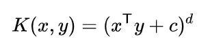
Above mentioned is the mathematical expression for Polynomial kernel. Let’s calculate the transformation and have a look at the new dimensions formulated by the kernel. In our dataset, x and y are X1 and X2 respectively.

From the above derivation, we got 3 new dimensions, viz., square of X1 (X12), square of X2 (X22), and multiplication of X1 and X2 (X1X2). Let’s calculate these and integrate with the main dataframe.
df['X1_Square']= df['X1']**2
df['X2_Square']= df['X2']**2
df['X1X2'] = (df['X1'] *df['X2'])
df.head()

Now, let’s plot these 3 newly formed dimensions in a 3D graph.
# Creating dataset
df1 = df[df.Y==0]
a = np.array(df1.X1_Square)
b = np.array(df1.X2_Square)
c = np.array(df1.X1X2)
# p = lr_preds

# Creating figure
plt.figure(figsize = (13,13))
ax = plt.axes(projection ="3d")

# Creating plot
ax.scatter3D(a, b, c, s=8, label='class 0')


# Creating dataset
df1 = df[df.Y==1]
a = np.array(df1.X1_Square)
b = np.array(df1.X2_Square)
c = np.array(df1.X1X2)


# Creating plot
ax.scatter3D(a, b, c, s=8, label='class 1')


ax. set_xlabel('X1_Square', fontsize=13)
ax. set_ylabel('X2_Square', fontsize=13)
ax. set_zlabel('X1X2', fontsize=13)
plt.legend(fontsize=12)

ax.view_init(30,250)

# show plot
plt.show()

After applying the kernel, we can easily imagine to fit a 2D plane between the two classes with all other similar theoretical concepts as discussed earlier. Unlike before kernel execution, now there exists a hyperplane which can successfully classify both the classes efficiently. This could only become possible due to the introduction of additional dimensions over the initial 2D Cartesian plane.
I hope I could provide you with a clear understanding of the Support Vector Machine Classifier algorithm and the internal process followed by it. The practical implementation using automated process with libraries are not described here, but I can assure that if the working of the algorithm is clear, model building is pretty straightforward.
You can refer to this sklearn SVC documentation link to understand more about model building and the practical implementation.
