While solving classification problem, there are certain metrics that are to be studied before making any decision. Some of the metrics include confusion, matrix, ROC curve, etc. Let’s study these matrices by practical use case. For this demonstration, I choose the breast cancer dataset provided by sklearn.
import pandas as pd, numpy as np,  matplotlib.pyplot as plt, seaborn as sns
from sklearn.datasets import load_breast_cancer
from sklearn.model_selection import train_test_split
from sklearn.linear_model import LogisticRegression
from sklearn import metrics
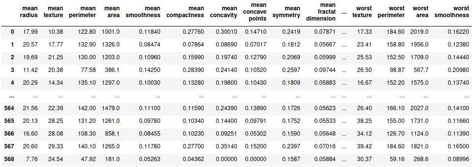
df = pd.DataFrame(load_breast_cancer()['data'], columns=load_breast_cancer()['feature_names'])
df['label'] = load_breast_cancer()['target']
df

Let’s first split the data set in to X and y where X is the set of independent variables and y is the dependent variable. X and y are further splitted into training and testing data sets.
X = df.drop('label', axis=1)
y = df.label
X_train,X_test, y_train,y_test = train_test_split(X,y, train_size=0.7, random_state=100)
Since we have got the required datasets, let’s fit a simple logistic regression model on the training dataset and find the probabilities of being predicted as positive when the training dataset itself is evaluated.
lg = LogisticRegression(max_iter=1000)
lg.fit(X_train, y_train)
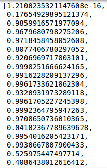
pred_prob = [i[1] for i in lg.predict_proba(X_train)]
pred_prob
Now since we have got the probability values, let’s try to obtain the value of threshold above which we classify the prediction to be positive otherwise negative. This decision is taken based on various metrices and the corresponding visualizations that we will be discussing further.
1. Confusion Matrix

- True Negatives (TN) – These are the values which are actually negative and have rightly been classified as negatives.
- False Positives (FP) – These are the values which are actually negative but have wrongly been classified as positives.
- True Positives (TP) – These are the values which are actually positive and have rightly been classified as positives.
- False Negatives (FN) – These are the values which are actually positive but have wrongly been classified as negatives.
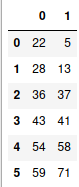
In order to understand the concept of confusion matrix, let’s consider the threshold to be 0.5.
sort = lambda x: 1 if x>=0.5 else 0
train_pred = [sort(i) for i in pred_prob]
conf = metrics.confusion_matrix(y_train, train_pred)
sns.heatmap(conf, cmap='YlGnBu', annot=True, fmt='.1f')
plt.xlabel('Predicted label')
plt.ylabel('Actual Label')
plt.show()
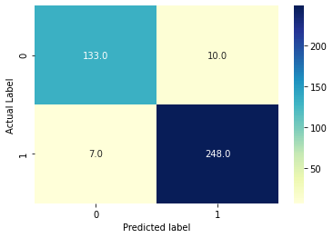
- TN = 133
- FP = 10
- TP = 248
- FN = 7
2. Accuracy, Sensitivity, Specificity, Precision, False Positive Rate
- Accuracy = (TP + TN) / (TN + FP + TP + FN)
- Sensitivity = TP / (TP + FN)
- Specificity = TN / (TN + FP)
- Precision = TP / (TP + FP)
- False Positive Rate (FPR) = FP / (TN + FP) = 1 – Specificity
Accuracy stands for the number of correctly classified data points among all the data points. Sensitivity stands for the number of rightly classified data points among the actual positive data points. It is also called Recall or True Positive Rate (TPR). Specificity stands for the number of rightly classified data points among all the actual negative data points. Precision stands for the the number of correctly classified data points among all the positive classifications. It is also called Positive Value Predicted (PVP). False Positive Rate (FPR) stands for the number of wrongly classified data points among the all the negative data points.
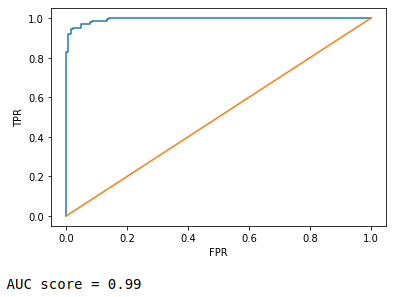
3. ROC (Receiver Operating Characteristic) curve and AUC (Area Under Curve) score
It is nothing but FPR vs. TPR graph, FPR in x-axis while TPR in y-axis at a range of different threshold values. You can read more about it here. AUC score is simple the area subtended by the ROC curve over x-axis. More the are, better the curve.
FPR,TPR,thresh = metrics.roc_curve(y_train, pred_prob)
plt.plot(FPR,TPR)
plt.plot([0,1],[0,1])
plt.xlabel('FPR')
plt.ylabel('TPR')
plt.show()
print('AUC score =', round(metrics.roc_auc_score(y_train, pred_prob),2))
4. Sensitivity vs. Specificity vs. Accuracy curve
In this metric, we identify the threshold by plotting the different values of sensitivities, specificities and accuracies at different values of threshold.
metr = pd.DataFrame({'Actual':y_train,'pred_prob':pred_prob})
curve = pd.DataFrame(columns=['Sensitivity','Specificity','Accuracy'])

for i in np.linspace(0.1,0.9,10):
    metr['predicted'] = metr.pred_prob.map(lambda x: 1 if x>i else 0)
    conf = metrics.confusion_matrix(metr.Actual, metr.predicted)
    sensitivity = metrics.recall_score(metr.Actual, metr.predicted)
    specificity = conf[0,0]/sum(conf[0])
    accuracy = metrics.accuracy_score(metr.Actual, metr.predicted)
    curve.loc[i] = [sensitivity, specificity, accuracy]

curve.index.rename('Threshold', inplace=True)
curve

Now we plot these with respect to threshold values and find the optimum value of threshold where value of these 3 metrices are highest.
plt.plot(curve.index,curve.Sensitivity, label='Sensitivity')
plt.plot(curve.index,curve.Specificity, label='Specificity')
plt.plot(curve.index,curve.Accuracy, label='Accuracy')
plt.grid(alpha=0.6)
plt.legend()
plt.show()
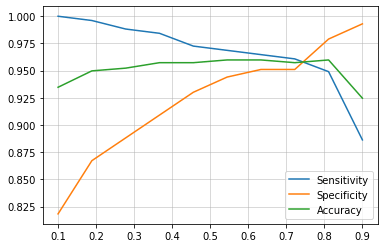
It is clearly visible that at around 0.75, sensitivity, specificity and accuracy have the highest values.
5. Precision-Recall curve
Similarly as before, here we plot different values of precision and recall at different values of threshold.
precision,recall,threshold = metrics.precision_recall_curve(y_train, pred_prob)
plt.plot(threshold, precision[:-1], label='Precision')
plt.plot(threshold, recall[:-1], label='Recall')
plt.grid(alpha=0.6)
plt.legend()
plt.show()

Here we can see that the highest value of precision and recall is at 0.6.
Now, there is a trade-off. We can either choose 0.75 or 0.6 depending on our priorities. Based on the domain knowledge, we can say that we can afford to misclassify a negative patient to be positive but can not afford a positive patient to misclassify as negative since it may cause a life threat. Thus we can say that we prioritize more sensitivity than specificity. Thus we can choose 0.6 which definitely would give more value of sensitivity than at 0.75
test_pred_proba = [i[1] for i in lg.predict_proba(X_test)]

sort = lambda x: 1 if x>=0.6 else 0
test_pred = [sort(i) for i in X_test_pred]

conf = metrics.confusion_matrix(y_test, test_pred)

print('Accuracy =',round(metrics.accuracy_score(y_test, test_pred),2))
print('Sensitivity/Recall =',round(metrics.recall_score(y_test, test_pred),2))
Accuracy = 0.96
Sensitivity/Recall = 0.96
Here we have obtained an accuracy and sensitivity of 96%. We have practically seen and understood the matrices involved in the decision making of a practical use case. I hope you found this interesting.


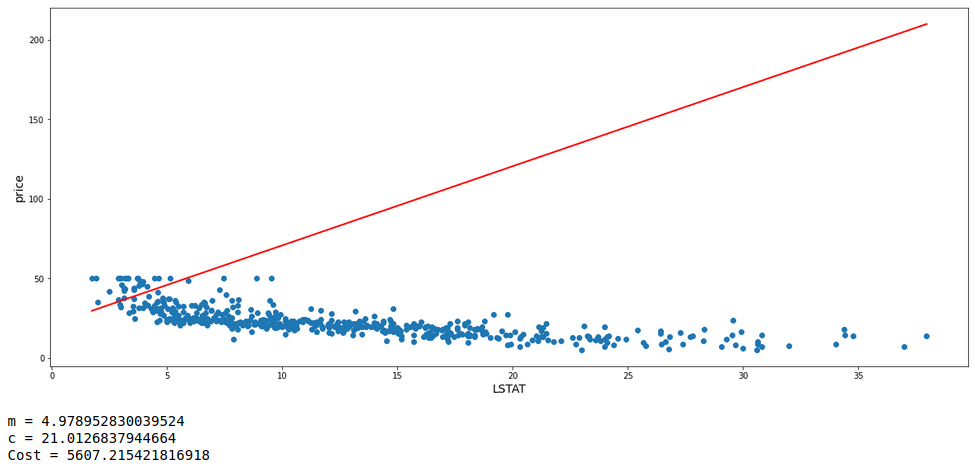
 Since m ≠ a + ( b * ||m|| ) due to the presence of ||m|| on the RHS,
Therefore, updated_m cannot be 0.
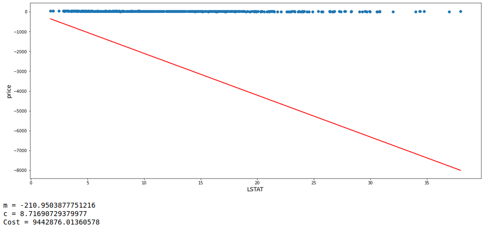
Since m ≠ a + ( b * ||m|| ) due to the presence of ||m|| on the RHS,
Therefore, updated_m cannot be 0.